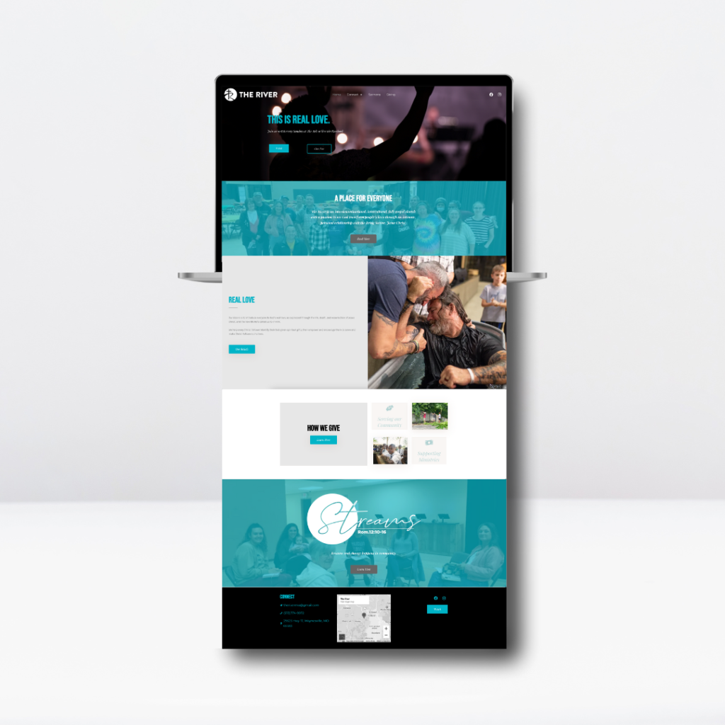
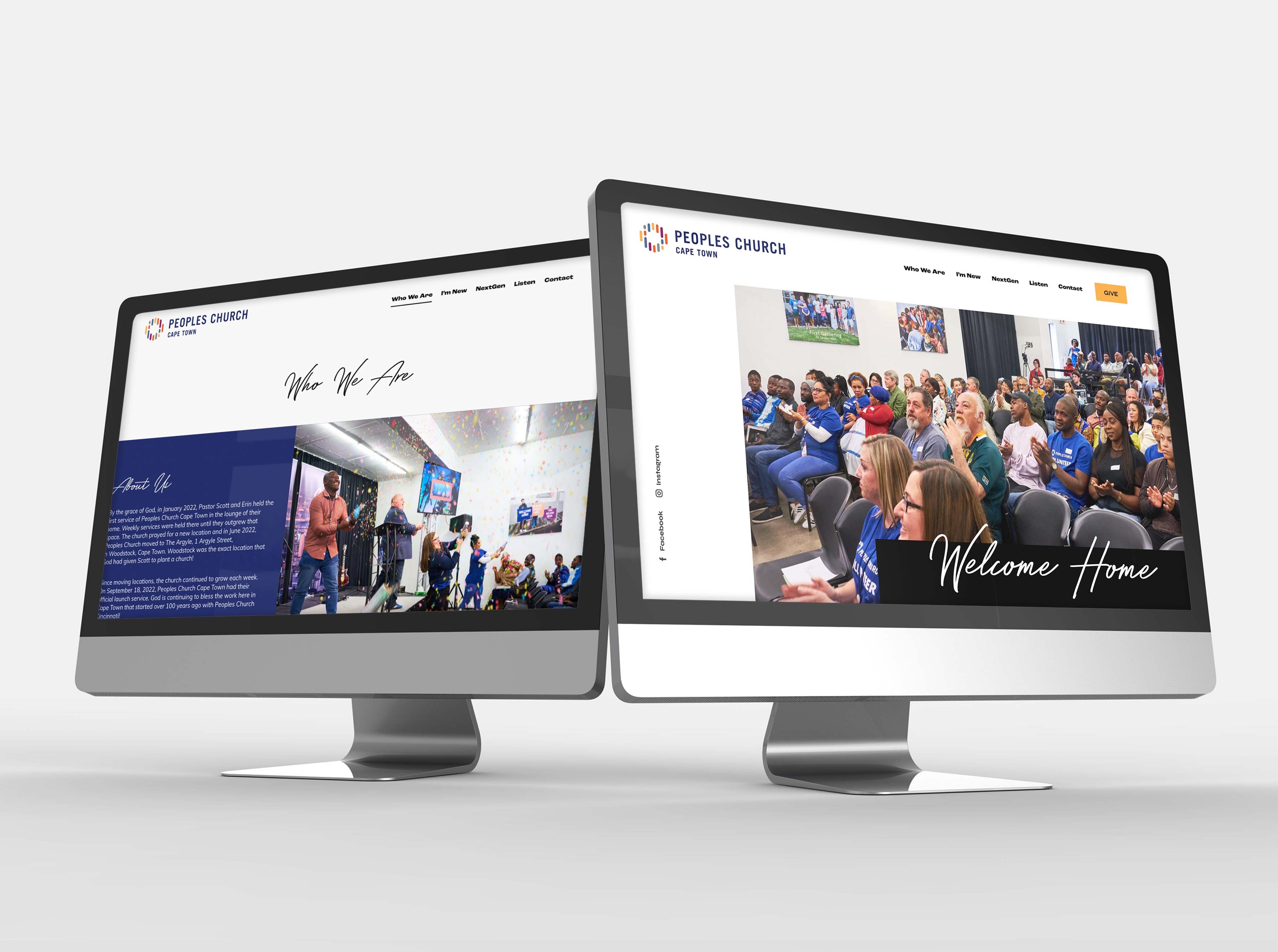
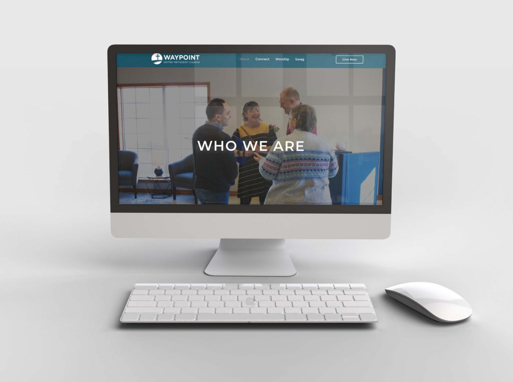
These days, it’s rare to find a church with no website at all. But not all websites are made alike. There are some fantastic church websites out there. But some church websites need major help. I like to think of doing a church website update like Extreme Makeover Home Edition. I want to unveil a shiny new church website of every pastor’s dreams and see the staff hug each other while sobbing. Okay, that may be a little dramatic. But the point I’m trying to make is your website should feel like a digital home for your church. It’s not only a hub for church members but many peoples’ first impressions of you. Your website represents who you are and what you value. So, what are the big no-nos to avoid having a pretty sad church website?
Too much content
Oh, if only I had a nickel for every website I updated that had too much content. The funny thing about this mistake is it’s hard to fix. Now, it’s not hard for me to pare down content. But it’s incredibly challenging for churches to let go of the content they feel is necessary. The problem? Most of it isn’t, and it only confuses people using your site. In fact, I once redid a website for a church with 40 pages. And that was AFTER convincing them to cut down and combine many of their existing pages!

A good rule of thumb for cutting down content is to try to keep your site between 3-10 pages. You may think you need more, but I promise you don’t. You don’t need a page for every individual ministry. And you don’t need a page for every form. Try creating larger pages with small sections for each ministry, no more than a few sentences. Google prefers larger pages and will rank these higher in search results!
Not enough photos or overuse of stock photos
Imagine putting stock photos of a family or friends eating dinner on social media. That would be ridiculous. Yet we’re okay with placing stock photos on our church website. Your website is where people go to see who you are. Stock photos can create distrust. A picture of someone who looks like me at your church helps build trust. I’d be much more likely to attend somewhere if I knew some real people looked happy to be there.

Getting pictures of your church doesn’t have to be expensive. If you can afford a photographer, that’s always the best option. But pics from a phone camera are always better than nothing. Your site should be full of pictures that represent your church body authentically. Take pics of your people talking in the lobby or singing in worship. Get shots of kids playing games and your pastor speaking passionately. And make sure to get some pics of your volunteers serving! These will go a long way in showing people who you are.
Confusing or Outdated Information
Often, when a church brings me on to update their website, I find a shocking amount of outdated or conflicting info. It’s likely because the church doesn’t have a dedicated person to keep up with the site. Another reason this happens is a site is just too big, so it’s impossible to keep up with every piece of content.
As we already discussed, keeping your site smaller will help with upkeep. But even small websites often sit on the back burner. I always recommend avoiding information that has to be regularly updated. So, if you want to have events on your site, try using a plugin that will sync with your church calendar. For example, if you use Planning Center Online, you could use the DisplayChurch plugin to sync your Calendar directly to your website.
If your staff has too much on their plates, it may be time to look into hiring a webmaster. At Elevate, we keep your site running smoothly and do light edits, like updating information for $60/month. It is a great option because your site stays up-to-date, plus a professional webmaster keeps it at top performance.
Your Website Matters
We may have first impression teams on Sundays, but most peoples’ first impression of your church is your website or social media. Your website is especially vital because it communicates who you are. It shows people a little piece of your church. It also helps members find their next steps and get more involved. If this article made you realize it’s time for some changes, don’t wait. Meet with your staff about what it would take to make these changes. And if you need help making it all happen, we’d love to partner with you. You deserve a website that reflects your church well!
Need a new website for your church? We’d love to partner with you! Click the button below to get your custom quote starting at $600!


